Your main objective when developing a website should be to provide the information your visitors are looking for as soon as possible, in a more professional and user-friendly manner, and in as little space as possible. Visitors are looking for comprehensive information that is displayed clearly on the website. They scan through a lot of material to get what they’re looking for, and if your website is busy and full of information, they’ll probably leave disappointed.
Keep a page organised and simple to navigate by using an accordion dropdown menu. It is the finest technique to fit a variety of content into a tiny area. It shortens any overly lengthy web pages and lessens clutter.
What is accordion dropdown?
In a nutshell, an accordion dropdown is a style for showing material in a vertically stacked list of headings that may be clicked to expose or hide content. Each concealed area will have a title and a visual signal, such as a plus sign or arrow button, to show that it can be expanded. These books will be presented graphically as a vertical list.
The concealed text and graphics are revealed when a visitor clicks on one of the titles. Panels may be collapsed once more.
Each WordPress accordion menu consists of two sections:
- Title – always visible; click it to reveal the content.
- Content – It is generally concealed. This message occurs when the toggle is extended.
Why should we use accordion menu?
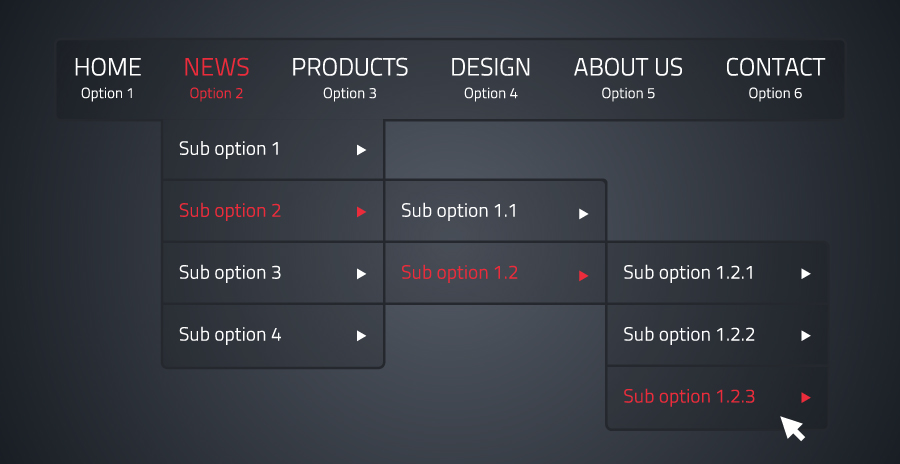
Your website’s usability can be increased even more by an accordion dropdown by:
- Providing information persistence: Users frequently close or power off their screen while viewing a site on mobile devices, then return to it later. Unlike menus, accordions will remain in their original state when they return, allowing people to quickly reorient themselves.
- Increasing the website’s speed: The text and images in the hidden panels can be loaded after the main list using accordions. This means that the summary loads quickly, and the additional details appear as panels are opened.
- Save a lot of space. The main benefit of using accordions is the capacity to conserve space on your website. Use tabs to hide all of the crucial information rather to generating excessively large pages. Allow consumers to quickly scan the headings to discover solutions to their questions.
- Content management. Because information is considerably easier to access, accordions also give the impression of organisation. An accordion’s contents are immediately apparent, giving your readers the user-friendliness that today’s websites need.
- Insert wherever. Any area of a WordPress website can be expanded with accordion plugins. An accordion is a logical solution, for instance, if you want to add some helpful information to a landing page without taking up a lot of room.
Where should we use accordion menu?
Here are some examples of accordion uses:
- FAQ sections: These pages serve the purpose of a list of questions, each with a paragraph or two of explanation. The titles of the accordion menu are the questions. Each response is concealed in a panel and may take the form of text, graphics, or even videos. The list can be rapidly scanned by visitors to locate the solution to their particular query.
- Regional information: You might have distinct shipping and return policies for each region you sell to if you do. Put this data in an accordion so that clients can only expand the sections that pertain to their location.
- Offer programmes or services. An accordion menu may help prospective customers choose the best option for them if you offer a range of service levels, packages, or courses. They can look for a bundle that satisfies their requirements and view information on only the items that appeal to them.
- Information-rich item listings: Examples of this include lists of statistics with concealed data charts, foods with concealed ingredients or nutritional information, and statements with concealed citations. The visitor can take in your key ideas and pertinent details, then delve further if they so choose.
How to Add an Accordion Dropdown to your WordPress Site
1. Guttenberg blocks
To generate content layouts, the new WordPress block editor, also known as Gutenberg, uses editor blocks called “Gutenberg blocks.” WordPress 5.0 introduced the Gutenberg editor, a totally block-based editor where each piece of content is a draggable block. It is more reliable due to:
- Control: Changing the visual accordion style.
- Compact: For the most part, blocks only load the CSS and JS needed for that particular block.
- Persistent: Blocks (typically) remain functional even after the plugin is removed.
- Reusable: Store your personalised accordions as reusable blocks for simple insertion.
WordPress Accordion Plugins:
- Accordion: A helpful WordPress plugin that enables responsive accordions.
- Kadence Blocks – Various pre-defined styles with total colour and layout customization. Even icons can be included in the accordion heading, which is a nestable block.
- Stackable – Nestable accordions, total style control If you upgrade, you can import “pro” styles in addition to the default.
Once you’ve installed a plugin, then follow the following steps:
- To add a new block to the editor, click the “+” sign. Then, to identify the appropriate block more easily, type “accordion” into the search area.
- Each toggle in the accordion group needs a title, as well as content that can be created or edited and displayed when the accordion is accessed. Rep each group block for the accordion.
- Choose which accordion panes you wish to open in step three. Choose whether each new pane shuts the preceding one or whether many panes can be open simultaneously.
- Modify the block colour and spacing parameters to create a customised appearance. You can match your website’s theme or copy the style of one that you like better.
2. Code
If you have the knack to set things up individually, then you can code your way to add accordion menu to WordPress using hard coding. For this, you may require the knowledge of HTML, CSS and JavaScript to execute the process.
These are the steps to add accordion dropdown menu:
-
- <li “=”” style=”” tve-u-182c907243e”=””>Create a folder on your desktop and name it
my-accordion
- .
- Open Notepad or any other text editor of your choice. Create a file called index-accordion.html and paste this code inside it for accordion HTML styling part.
<!DOCTYPE html><html lang=”en”><head><meta charset=”UTF-8″<meta name=”viewport” content=”width=device-width, initial-scale=1.e”><meta http-equiv=”X-UA-Compatible” content=”ie=edge”><title>Document</title><link rel=”stylesheet” href=”accordion-styles.css”></head><body> <script src=”accordion-app. js” type=”text/javascript”></script></body></html>
This sets up the initialization of the content of adding the plugin.
3. In <body>, add this code
<div><divcontainer”><div>wWhat is WordPress</div><div>WordPress is the simplest, most popular way to create your own website or blog.</div></div><hr><div><div >What is Accordion?</div><div>Accordion in WordPress is a style for displaying content in a vertically stacked list of headings .k/div></div>
This sets up the markup for the accordion dropdown menu.
4. Now its time to bring some more fluidness to the accordion menu. Let’s add some Accordion CSS styling under <head>.
-container 7background-color: #eee;color: #444;cursor: pointer;padding: 18px;width: 100%;text-align: left;border: none;outline: none;transition: @.4s;
}
/* Add a background color to the button if it is clicked on (add the .active class with JS), and when you move the mouse over it (hover) */.active, .container|: hover {background-color: #ccc;
}
/* Style the accordion panel. Note: hidden by default */-panel {padding: @ 18px;background-color: white;
display: none;
overflow: hidden;
5.To make the accordion dropdown menu more functional, now we will add some touch of JavaScript on it. So Accordion JS will be our next step.
<script>var acc = document.getElementsByClassName(“container|var i;”3for (i = @; i < acc.length; i++) {acc[i].addEventListener(“click”, function() {this.classList.toggle(“active”);var panel = this.nextElementSibling;if (panel.style.maxHeight) {panel.style.maxHeight = null;} else {panel.style.maxHeight = panel.scrollHeight + “px”;3}
</script>3
6. For enhancing the accordion to be more dynamic, include the following code in the panel class: The max-height attribute has the following values: 0, overflow: hidden, and a transition.
<style>-panel {padding: @ 18px;background-color: white;max-height: @;overflow: hidden;transition: max-height @.2s ease-out;}</style>
7. Now, we will add icons like (+, -, <, > etc.) to the accordion menu.
/* Positions the plus sign 5px from the left. Centers it using the transform property. */
.accordion .label::after {content: ‘+’;
color: black;position: absolute;top: 50%;right: -5px;font-size: 3@px;transform: translateY(-50%) ;}/* Hides the content (height: @), decreases font size, justifies text and adds transition */-accordion .content {position: relative;background: white;height: @;font-size: 2@px;text-align: justify;width: 78@px;overflow: hidden;transition: @.5s;}/* Adds a horizontal line between the contents */-accordion hr {width: 100;margin-left: @;border: 1px solid grey;
This will add the sign (+) after the title of the accordion items.
/* Unhides the content part when active. Sets the height */.accordion .container.active .content {height: 15@px;}/* Changes from plus sign to negative sign once active */-accordion .container.active .label::after| {content: ‘-‘;font-size: 3@px;}
This will add the sign (-) to the accordion menu after the user expands the item.
8. Save the file my-accordion.
9. Open the WordPress admin file with the help of FTP client in the root directory and upload the file.
3. Page Builder
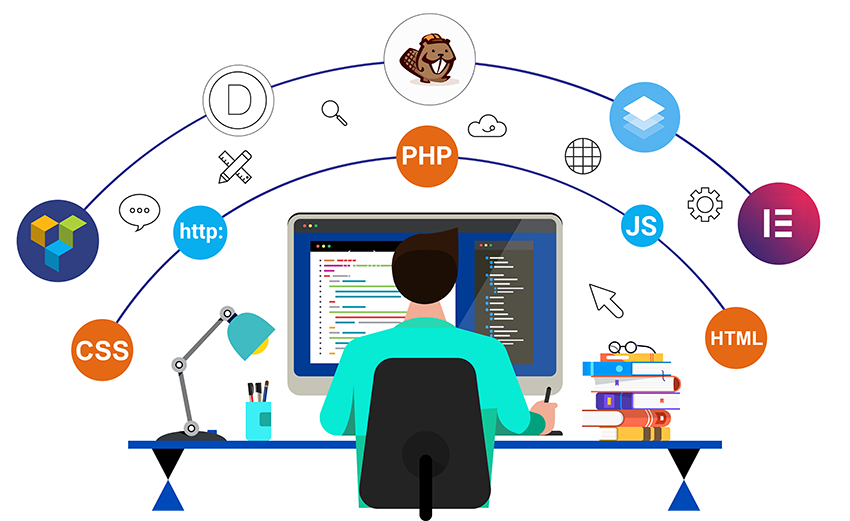
You can also create a website without writing a single line of code by using page builders. Every customization is as simple as dragging and dropping, and your front end will look fantastic. Suggestions include Beaver Builder, Divi, Elementor, and more.
In this instance, we’ll employ Elementor Website Builder. To add an accordion button after installing the plugin, follow these instructions:
- Select the Elements tab and search for the Accordion widget.
- Drag the symbol to the home screen. The page will now have a default menu.
- Edit the Accordion#1 element that is listed in the Edit Accordion tab.
- Select the Content tab and change the title and description of the accordion button.
- Modify the accordion’s width and border on the Style tab.
- In the Title subtab of the Style tab, change the background colour, active colour, and font for the accordion menu header.
- Repeat for the Icon and Content subtabs.
- Choose the Advanced tab and change the padding and margin of the accordion menu.
- Select Update to update the accordion dropdown menu.
P.S. – In their widget list, they all have toggles for accordions.
Best practices when using accordions
- Customer first – Check to see if the accordion enhances (or detracts from) the user experience.
- Theme Standardisation – Try to maintain your accordion styles from post to post. Your website could look unprofessional if they vary on each page. Reusable blocks in Gutenberg might help you maintain consistency in your styling.
- Mobile-friendly – Make sure your accordions can be used on small displays and look excellent. On mobile devices, make sure the content of the accordion isn’t pushed off the screen or chopped off. On mobile devices, make sure the content of the accordion isn’t pushed off the screen or chopped off.
- A little is better – A lot of older accordion plugins feature out-of-date settings (to put it nicely). With just a dash of colour to pop out on the page, simple designs are frequently the finest (or match your theme). Your accordion titles must not have bubble backgrounds or flashing text.
Conclusion
Nobody likes to search through lengthy pages of text to find the information they need. An alternate approach of organising content that makes it simple to identify subjects and elegantly condense a lot of data into a small area is the accordion menu. As we’ve seen, using accordions in a variety of ways can boost user engagement and provide customers more for their money. The purpose of accordions and the necessity for them on your website should be obvious, allowing you to select the best technique and plugin to make the most of the accordion menu. Visit HelpBot.net, where a team of developers will be pleased to help you, for additional information. To improve your WordPress website creation skills, you may also consult our informative blogs.


